The curious case of Simpson’s Paradox
Statistical tests and analysis can be confounded by a simple misunderstanding of the data
This article was originally published here
Photo by Brendan Church on Unsplash
Statistics rarely offers a single “right”way of doing anything — Charles Wheelan in Naked Statistics
In 1996, Appleton, French, and Vanderpump* conducted an experiment to study the effect of smoking on a sample of people. The study was conducted over twenty years and included 1314 English women. Contrary to the common belief, this study showed that Smokers tend to live longer than non-smokers. Even though I am not an expert on the effects of smoking on human health, this finding is disturbing. The graph below shows that smokers had a mortality rate of 23%, while for non-smokers, it was around 31%.
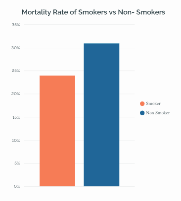
The mortality rate of smokers vs. non-smokers
Now, here’s where the things get interesting. On breaking the same data by age group, we get an entirely different picture. The results show that in most age groups, smokers have a high mortality rate compared to non-smokers.
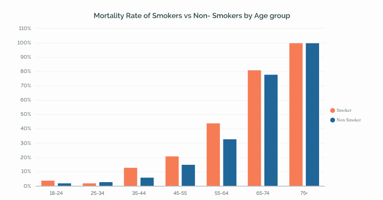 Results of the study broken down by age group
So why the confusion?🤔
Well, the phenomenon that we just saw above is a classic case of Simpson’s paradox, which from time to makes way into a lot of data-driven analysis. In this article, we’ll look a little deeper into it and understand how to avoid fallacies like these in our analysis.
Simpson’s Paradox: Things aren’t always as they seem
 Image by Carlos Ribeiro from Pixabay
As per Wikipedia, Simpson’s paradox also called the Yule-Simpson effect, can be defined as follows:*
In other words, the same data set can appear to show opposite trends depending on how it’s grouped. This is exactly what we saw in the smokers vs. non-smokers mortality rate example. When grouped age-wise, the data shows that non-smokers tend to live longer. But when we see an overall picture, smokers tend to live longer. So what is exactly happening here? Why are there different interpretations of the same data, and what is evading our eye in the first case? Well, The culprit, in this case, is called the Lurking variable — a conditional variable **that can affect our conclusions about the relationship between two variables — smoking and mortality in our case.
Identifying the Lurking variable 🔍

Lurking means to be present in a latent or barely discernible state, although still having an effect. In the same way, a lurking variable is a variable that isn’t included in the analysis but, if included, can considerably change the outcome of the analysis.
The age groups are the lurking variable in the example discussed. When the data were grouped by age, we saw that the non-smokers were significantly older on average, and thus, more likely to die during the trial period, precisely because they were living longer in general.
Try it out for yourself. 💻
Here is another example where the effect of Simpson’s Paradox is easily visible. We all are aware of the Palmer Penguins🐧 dataset — the drop-in replacement for the famous iris dataset. The dataset consists of details about three species of penguins, including their culmen length and depth, their flipper length, body mass, and sex. The culmen is essentially the upper ridge of a penguin’s beak, while their wings are called flippers. The dataset is available for download on Kaggle.
 Nature vector created by brgfx — www.freepik.com | Attribution 1.0 Generic (CC BY 1.0)
Importing the necessary libraries and the dataset
import pandas as pd
import seaborn as sns
from scipy import stats
import matplotlib.pyplot as plt
%matplotlib inline

#plt.rcParams['figure.figsize'] = 12, 10
plt.style.use("fivethirtyeight")# for pretty graphs

df  = pd.read_csv('[penguins_size.csv'](https://raw.githubusercontent.com/parulnith/Website-articles-datasets/master/penguins_size.csv'))
df.head()')
df.info()
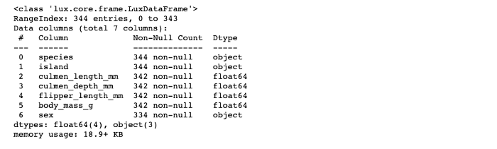
There are few missing values in the dataset. Let’s get rid of those.
df = df.dropna()
Let’s now visualize the relationship between the culmen length of the penguins vs. their culmen depth. We’ll use seaborn’s lmplot method (where “lm” stands for “linear model”)for the same.
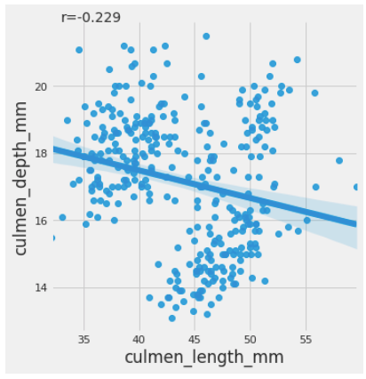
Here we see a negative association between culmen length and culmen depth for the data set. The results above demonstrate that the longer the culmen or the beak, the less dense it is. We have also calculated the correlation coefficient between the two columns to view the negative association using the Pearson correlation coefficient(PCC), referred to as Pearson’s r. The PCC is a number between -1 and 1 and measures the linear correlation between two data sets. The Scipy library provides a method called pearsonr() for the same.
Drilling down at Species level
When you drill down further and group the data species-wise, the findings reverse. The ‘hue’ parameter determines which column in the data frame should be used for color encoding.
sns.lmplot(x = 'culmen_length_mm',y = 'culmen_depth_mm', data = df, hue = 'species')
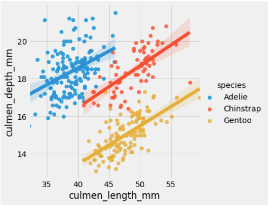
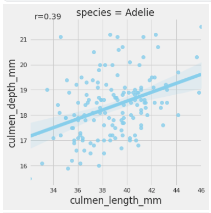
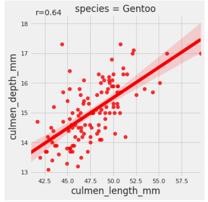
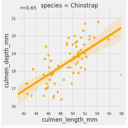
Voila! What we have is a classic example of Simpson’s effect. While the culmen’s length and depth were negatively associated on a group level, the species level data exhibits an opposite association. Thus the type of species is a lurking variable here. We can also see the person’s coefficient for each of the species using the code below:
Here is the nbviewer link to the notebook incase you want to follow along.
Tools to discover Simpson’s effect 🛠
Detecting Simpson’s effect in a dataset can be tricky and requires some careful observation and analysis. However, since this issue pops up from time to time in the statistical world, few tools have been created to help us deal with it. A paper titled “Using Simpson’s Paradox to Discover Interesting Patterns in Behavioral Data.” was released in 2018, highlighting a data-driven discovery method that leverages Simpson’s paradox to uncover interesting patterns in behavioral data. The method systematically disaggregates data to identify subgroups within a population whose behavior deviates significantly from the rest of the population. It is a great read and also has the link to the code.
Conclusion
Data comes with a lot of power and can be easily manipulated to suit our needs and objectives. There are multiple ways of aggregating and grouping data. Depending upon how it is grouped, the data may offer confounding results. It is up to us to carefully assess all the details using the statistical tools and look for lurking variables that might affect our decisions and outcomes.