A better way to visualize Decision Trees with the dtreeviz library
An open-source package for decision tree visualization and model interpretation
The article was originally published here

It is rightly said that a picture is worth a thousand words. This axiom is equally applicable for machine learning models. If one can visualize and interpret the result, it instills more confidence in the model’s predictions. Visualizing how a machine learning model works also makes it possible to explain the results to people with less or no machine learning skills. Scikit-learn library inherently comes with the plotting capability for decision trees via the sklearn.tree.export_graphviz function. However, there are some inconsistencies with the default option. This article will look at an alternative called dtreeviz that renders better looking and intuitive visualizations while offering greater interpretability options.
dtreeviz library for visualizing tree-based models
The dtreeviz is a python library for decision tree visualization and model interpretation. According to the information available on its Github repo, the library currently supports scikit-learn, XGBoost, Spark MLlib, and LightGBM trees.
Here is a visual comparison of the visualization generated from default scikit-learn and that from dtreeviz on the famous wine quality dataset. The dataset includes 178 instances and 13 numeric predictive attributes. Each data point can belong to one of the three classes named class_0, class_1, and class_2.

Visual comparison of the visualization generated from default scikit-learn(Left) and that from dtreeviz(Right) on the famous wine quality dataset
As is evident from the pictures above, the figure on the right delivers far more information than its counterpart on the left. There are some apparent issues with the default scikit learn visualization, for instance:
- It is not immediately clear as to what the different colors represent.
- There are no legends for the target class.
- The visualization returns the count of the samples, and it isn’t easy to visualize the distributions.
- The size of every decision node is the same regardless of the number of samples.
The dtreeviz library plugs in these loopholes to offer a clear and more comprehensible picture. Here is what the authors have to say:
The visualizations are inspired by an educational animation by R2D3; A visual introduction to machine learning. With
dtreeviz, you can visualize how the feature space is split up at decision nodes, how the training samples get distributed in leaf nodes, how the tree makes predictions for a specific observation and more. These operations are critical to for understanding how classification or regression decision trees work.
We’ll see how the dtreeviz scores over the other visualization libraries through some common examples in the following sections. For the installation instructions, please refer to the official Github page. It can be installed with pip install dtreeviz butrequires graphviz to be pre-installed.
Superior visualizations by dtreeviz
Before visualizing a decision tree, it is also essential to understand how it works. A Decision Tree is a supervised learning predictive model that uses a set of binary rules to calculate a target value. It can be used both for regression as well as classification tasks. Decision trees have three main parts:
- Root Node: The node that performs the first split.
- Terminal Nodes/Leaf node: Nodes that predict the outcome.
- Branches: arrows connecting nodes, showing the flow from question to answer.
The algorithm of the decision tree models works by repeatedly partitioning the data into multiple sub-spaces so that the outcomes in each final sub-space are as homogeneous as possible. This approach is technically called recursive partitioning. The algorithm tries to split the data into subsets so that each subgroup is as pure or homogeneous as possible.
The above excerpt has been taken from an article I wrote on understanding decision trees. This article goes deeper into explaining how the algorithm typically makes a decision.
Now let’s get back to the dtreeviz library and plot a few of them using the wine data mentioned above.
Dataset
We’ll be using the famous red wine dataset from the Wine Quality Data Set. The dataset consists of few physicochemical tests related to the red variant of the Portuguese “Vinho Verde” wine. The goal is to model wine quality based on these tests. Since this dataset can be viewed both as a classification and regression task, it is apt for our use case. We will not have to use separate datasets for demonstrating the classification and regression examples.
Here is the nbviewer link to the notebook incase you want to follow along.
Let’s look at the first few rows of the dataset:

A glance at the dataset
The quality parameter refers to the wine quality and is a score between 0 and 10

Visualizations
Creating the features and target variables for ease.
features = wine.drop(‘quality’,axis=1)
target = wine[‘quality’]
Regression decision tree
For the regression example, we’ll be predicting the quality of the wine.
 #Regression tree on Wine data
fig = plt.figure(figsize=(25,20))
regr= tree.DecisionTreeRegressor(max_depth=3) regr.fit(features, target)viz = dtreeviz(regr,
               features,
               target,
               target_name='wine quality',
               feature_names=features.columns,
               title="Wine data set regression",
               fontname="Arial",
               colors = {"title":"purple"},
               scale=1.5)
viz

Regression decision tree
- The horizontal dashed lines indicate the target mean for the left and right buckets in decision nodes;
- A vertical dashed line indicates the split point in feature space.
- The black wedge highlights the split point and identifies the exact split value.
- Leaf nodes indicate the target prediction (mean) with a dashed line.
Classification decision tree
For the classification example, we’ll predict the class of wine from the given six classes. Again the target here is the quality variable.
# Classification tree on Wine datafig = plt.figure(figsize=(25,20))
clf = tree.DecisionTreeClassifier(max_depth=3)clf.fit(features, target)# pick random X observation for demo
#X = wine.data[np.random.randint(0, len(wine.data)),:]viz = dtreeviz(clf,
               features,
               target,
               target_name='wine quality',
               feature_names=features.columns,
               title="Wine data set classification",
               class_names=['5', '6', '7', '4', '8', '3'],
               histtype='barstacked', # default
               scale=1.2)
viz
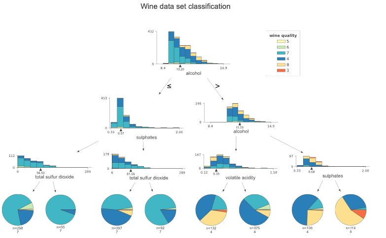
Classification tree on Wine data
Unlike regressors, the target is a category for the classifiers. Therefore histograms are used to illustrate feature-target space. The stacked histograms might be challenging to read when the number of classes increases. In such cases, the histogram type parameter can be changed to barfrom barstacked, which is the default.
Customizations
The dtreeviz library also offers a bunch of customizations. I’ll showcase a few of them here:
Scaling the image
The scale parameter can be used to scale the overall image.
Trees with a left to right alignment
The orientation parameter can be set to LR to display the trees from left to right rather than top-down
fig = plt.figure(figsize=(25,20))
clf = tree.DecisionTreeClassifier(max_depth=2)clf.fit(features, target)# pick random X observation for demo
#X = wine.data[np.random.randint(0, len(wine.data)),:]viz = dtreeviz(clf,
               features,
               target,
               target_name='wine quality',
               feature_names=features.columns,
               title="Wine data set classification",
               class_names=['5', '6', '7', '4', '8', '3'],
               **orientation='LR',**
               scale=1.2)
viz

Trees with left to right alignment
Prediction path of a single observation
The library also helps to isolate and understand which decision path is followed by a specific test observation. This is very useful in explaining the prediction or the results to others. For instance, let’s pick out a random sample from the dataset and traverse its decision path.
fig = plt.figure(figsize=(25,20))
clf = tree.DecisionTreeClassifier(max_depth=3)clf.fit(features, target)**# pick random X observation for demo
X = features.iloc[np.random.randint(0, len(features)),:].values**viz = dtreeviz(clf,
               features,
               target,
               target_name='wine quality',
               feature_names=features.columns,
               title="Wine data set classification",
               class_names=['5', '6', '7', '4', '8', '3'],
               scale=1.3,
               X=X)
viz

Prediction path of a single observation
Saving the image
The output graph can be saved in an SVG format as follows:
viz.save_svg()
Conclusion
The dtreeviz library scores above others when it comes to plotting decision trees. The additional capability of making results interpretable is an excellent add-on; You can isolate a single data point and understand the prediction at a micro-level. This helps in better understanding a model’s predictions, and it also makes it easy to communicate the findings to others. What I have touched here is just the tip of the iceberg. The Github repository and the accompanying article by the author go into more detail, and I’ll highly recommend going through them. The links are in the reference section below.
References and further reading
- The official Github repository of dtreeviz.
- How to visualize decision trees — A great read on decision tree visualization by creators of dtreeviz.
- Understanding Decision Trees